Realistic ceramic materials with three.js
This is the third article in my series about my first long-form generative art project Ceramics, which is being released in Art Blocks’ Curated collection today! In this article we’re making materials with three.js that look and feel like physical ceramics, it follows on from my first article on making textured surfaces with three.js.
Lighting and clay
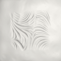
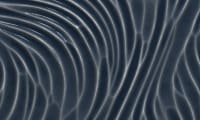
Getting the feel of the material right was paramount to Ceramics’ believability, and that started with the lighting. I found that with multiple lights or any lighting from underneath, the designs look embossed rather than carved out. Having a single light coming from above was the most convincing because we’re so used to the sun casting shadows from above us. I used one AmbientLightAmbientLight to set a low level of global illumination, and one PointLightPointLight which shades the strokes and reflects of some of the high points.
I spent a long time researching different types of clay and how their appearance changed between the stages of firing. I wanted to show a wide breadth of pottery materials, from fine china to high-grog industrial clay, because they imply different levels of strength and delicacy, and I think those qualities can be felt through the screen.
At one point I was planning on having a base clay feature and a firing temperature feature and generatively constructing the colour and lighting settings from that, but found that a) it would never be accurate and that would haunt me, and b) being able to finely tune the colours and textures and lighting gave each material a distinct personality which I’m really proud of. I ended up with four ‘base’ clays and three states: raw (unfired), bisque-fired, and glazed.
Three.js’s MeshPhysicalMaterialMeshPhysicalMaterial provides all the functionality to make a surface feel real by reacting to light with varied reflectivity and roughness. I had to be very particular with these settings for each of Ceramics’ materials to make them feel true to their physical counterpart. The demo below shows the settings I used for each material and you can see how much the feel of each material changes by tweaking them.
Colour and texture
The lighting makes the strokes look realistic but in flat areas the materials look plain and unconvincing. I had two approaches for improving this: by adding more texture to the surface of the material, and by adding colour variation and speckling to the clay itself.
Surface texture
As I went through in my first Ceramics article, when we’re constructing the mesh we individually set the z-value of each point on the plane based on the bump map of the canvas, but we can tweak that value in the same step.
I used layers of 2D noise to add macro surface texture and little pockmarks, and I organically smoothed down the edges of the surface to create a light vignetting effect. I softened the texture on the glazed materials to make them look more finished, but they add a lot of personality to the raw and bisque-fired clays.
Speckling
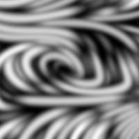
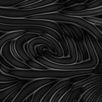
At this point the pieces look pretty realistic at thumbnail size, but to make them feel realistic in high definition there needed to be more visual interest in the clay material. As usual, I thought through a tonne of complicated ways of going about this (could I make 3D terrazzo-esque specks that could be carved into?) but I found that a subtle 2D background texture is very convincing, and avoided the complexity and performance concerns that other methods may have involved.
I decided to use a technique I’ve played with before to make subtle generative backgrounds – using a 2D canvas to draw lots of tiny low-opacity polygons.
Code snippet
const lerp = (min, max, t) => min + (max - min) * t

const drawPolygon = (c, startX, startY) => {
  const alpha = lerp(minAlpha, maxAlpha, Math.random())
  const sides = Math.floor(lerp(minSides, maxSides + 1, Math.random()))
  const size = lerp(minSize, maxSize, Math.random())
  const startAngle = Math.random() * Math.PI * 2

  c.globalAlpha = alpha
  c.beginPath()
  const corners = Array.from({ length: sides }, (_, edgeI) => {
    const dist = lerp(size * uniformity, size, Math.random())
    const angle = startAngle + (Math.PI * 2 * edgeI) / sides
    let x = Math.cos(angle) * dist + startX
    let y = Math.sin(angle) * dist + startY
    return [x, y]
  })

  corners.forEach(([x, y]) => c.lineTo(x, y))
  c.fill()
}const lerp = (min, max, t) => min + (max - min) * t
const drawPolygon = (c, startX, startY) => {
const alpha = lerp(minAlpha, maxAlpha, Math.random())
const sides = Math.floor(lerp(minSides, maxSides + 1, Math.random()))
const size = lerp(minSize, maxSize, Math.random())
const startAngle = Math.random() * Math.PI * 2
c.globalAlpha = alpha
c.beginPath()
const corners = Array.from({ length: sides }, (_, edgeI) => {
const dist = lerp(size * uniformity, size, Math.random())
const angle = startAngle + (Math.PI * 2 * edgeI) / sides
let x = Math.cos(angle) * dist + startX
let y = Math.sin(angle) * dist + startY
return [x, y]
})
corners.forEach(([x, y]) => c.lineTo(x, y))
c.fill()
}Have a play with this demo to see the sort of textures that can be made with this simple technique.
I found that combining large polygons that were a similar colour to the background with tiny specks that were much darker or lighter could make a rich texture without needing many layers (I wanted to avoid this so there wouldn’t be too many random numbers and colours in my final script). They don’t look like much as flat images but when applied to the carved surface they massively contribute to the illusion of materiality.
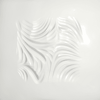
Glazes
Adding glazes was the breakthrough moment in this project. I loved the clays as they were but glazing introduced the opportunity for much more variation in the collection. To make the glaze look realistic I wanted to give the impression of viscosity – glaze pooling in the grooves and receding around sharp edges.
I created the colours and textures of the glazes with the same method as above, and I figured that to create the feel I was aiming for, I needed to have some sort of masking layer to determine how much of the glaze to show at any given point.
I considered copying the method I used to set the stroke depth, by drawing the strokes on another 2D canvas but with a different gradient setup to highlight the edges of the strokes, but that would have doubled load times and been pretty complex.
Blurring the speckle layers made me wonder whether I could use a blurred version of the strokes and composite operations to achieve the effect I was looking for. This turned out to be much easier than expected and astonishingly effective.
By taking the difference between the blurred and unblurred images, the edges of each stroke are highlighted; it’s especially prominent along the ridges where curves overlap each other. It also highlights the centre of each stroke which adds to the impression of the glaze sticking to the walls, reinforcing a sense of depth. I used this difference as a mask for the glaze canvas, the darker areas showing more glaze and the lighter areas less.
Code snippet
// assuming we have the following canvases and contexts set up
const strokeCanvas, strokeC,
      materialCanvas, materialC,
      glazeCanvas, glazeC

// draw the strokes on top of one another but with blur and the difference blend mode
strokeC.filter = `blur(${blur}px)`
strokeC.globalCompositeOperation = 'difference'
strokeC.drawImage(strokeCanvas, 0, 0)

// set the alpha channel of the glaze canvas based on the red channel of the stroke canvas
const strokeImageData = strokeC.getImageData(0, 0, width, height).data
const glazeImageData = glazeC.getImageData(0, 0, width, height).data
for (let x = 0; x < width; x++) {
  for (let y = 0; y < height; y++) {
    const i = (x + (height - 1 - y) * width) * 4
    const opacity = 255 - strokeImageData[i] * multiplier
    glazeImageData[i + 3] = opacity
  }
}
glazeC.putImageData(new ImageData(glazeImageData, width, height), 0, 0)

// draw the glaze onto the material canvas
materialC.drawImage(glazeCanvas, 0, 0, width, height)

// create MeshPhysicalMaterial with the background of the material canvas
const material = new THREE.MeshPhysicalMaterial({
  map: new THREE.CanvasTexture(materialCanvas),
})// assuming we have the following canvases and contexts set up
const strokeCanvas, strokeC,
materialCanvas, materialC,
glazeCanvas, glazeC
// draw the strokes on top of one another but with blur and the difference blend mode
strokeC.filter = `blur(${blur}px)`
strokeC.globalCompositeOperation = 'difference'
strokeC.drawImage(strokeCanvas, 0, 0)
// set the alpha channel of the glaze canvas based on the red channel of the stroke canvas
const strokeImageData = strokeC.getImageData(0, 0, width, height).data
const glazeImageData = glazeC.getImageData(0, 0, width, height).data
for (let x = 0; x < width; x++) {
for (let y = 0; y < height; y++) {
const i = (x + (height - 1 - y) * width) * 4
const opacity = 255 - strokeImageData[i] * multiplier
glazeImageData[i + 3] = opacity
}
}
glazeC.putImageData(new ImageData(glazeImageData, width, height), 0, 0)
// draw the glaze onto the material canvas
materialC.drawImage(glazeCanvas, 0, 0, width, height)
// create MeshPhysicalMaterial with the background of the material canvas
const material = new THREE.MeshPhysicalMaterial({
map: new THREE.CanvasTexture(materialCanvas),
})In the demo below you can play with the material and glaze combinations, and the blur settings.
Using just the difference between the blurred and original images looks a bit artificial in some areas so I added a noise texture to make them blend more organically, mimicking the tiny specks of minerals in the glaze that are more visible when the glaze is thinly-applied. I also decided to slightly blur the whole of the depth map on glazed outputs so it looks like the thickness of the glaze has smoothed out the sharp edges.
Final thoughts
I hope you have enjoyed this deep-dive into how I created the look and feel of Ceramics. There were many more rabbit holes and frustrating refactors while making these effects than I’ve shared here, but I hope this reinforces that you can create any effect imaginable with code if you bang your head against a wall for long enough.
I’m finishing this blog post 2 hours before Ceramics goes live and it feels like my life is about to change. I’m so grateful that I’m getting the opportunity to share this project with the Art Blocks community, and my mind is already fizzing with what I want to create next (health permitting). Regardless of what I make I’ll be writing up the process here, exposing everything I learn, hopefully for a long time hence.
Likes and comments


Luke Meyrick replied :
This is an absolutely freekin' amazing article! The demos are soooo gorgeous and all the attention to detail is just incredible 👏👏👏🙇♂️🙇♂️🙇♂️
